
Prime Acoustic Solutions
A bright, approachable identity created to give a specialist acoustic business a professional and distinctive presence across its logo, website, messaging and branded workwear.
A technical service that needed a more human identity.
Prime Acoustic Solutions needed a brand that could communicate specialist knowledge without feeling cold, corporate or overly technical. The business required an identity that would work equally well online, on customer-facing material and on practical workwear.
The visual direction combined a clear, modern logo with a lively blue and pink palette. The colours helped the business feel accessible and memorable, while the overall layout and typography retained the confidence expected from a professional service company.
Clear, energetic and easy to recognise.
The logo was designed to feel contemporary and confident, but not severe. Its clean form gave Prime Acoustic Solutions a strong foundation that could be carried consistently across the website, clothing and supporting graphics.
- A bold logo that remained clear at small sizes and on embroidered workwear.
- A blue-led palette that suggested clarity, support and technical competence.
- A contrasting pink accent that introduced warmth and helped important messages stand out.
Technical expertise, expressed simply.
The supporting language was intentionally direct and customer-focused. Rather than filling the brand with technical terminology, short statements such as “Top Customer Support” and “It’s all about you” shifted attention towards the experience of working with the business.
The contrast between blue and pink gave those statements visual energy and made the communication feel friendlier than the identity of a typical technical contractor.
“We needed a logo and branding for the business. This was delivered well above our expectations.”
Designed to work beyond the screen.
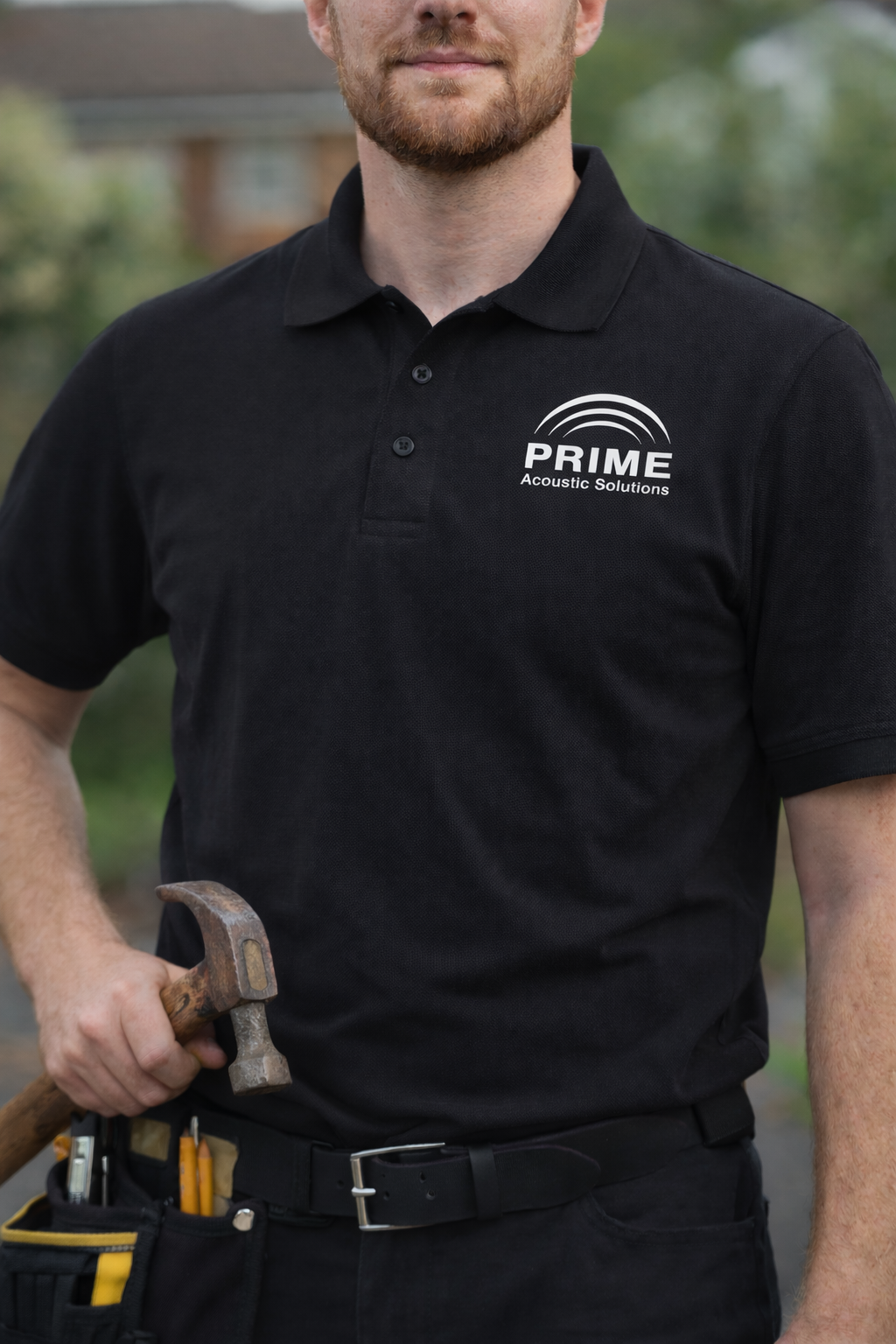
A successful identity needs to remain recognisable wherever customers encounter it. The Prime logo was applied to branded polo shirts, giving the team a professional appearance while keeping the identity clear and practical.
“We needed a logo and branding for the business. This was delivered well above our expectations.”Alfie Laughland, Formerly of Prime Acoustic Solutions
Branding that works online, in print and in the real world.
Symonds Creative creates logos and practical brand identities for smaller businesses that need to look established, consistent and ready to meet customers.
Discuss Your Branding ProjectReturn to project examples